RBI explained
RBI and income
Effects on real incomes
The price increases themselves are only one part of the story. To understand what has happened to living standards over the last few years, we need to also look at how earnings have varied across the whole population. Using, again, recently published ONS data, we can find the average money earnings for each decile group, from poorest to richest.6 With our new inflation rates, we can then turn these money figures into “real terms”, assessing incomes today in terms of how much they would buy without the impact of inflation.
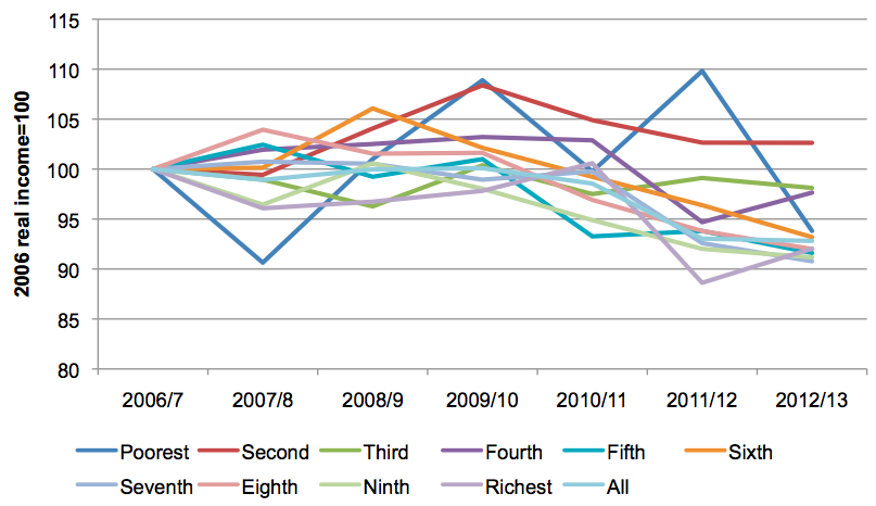
We find that pre-tax incomes in general are down on their pre-crash levels, with some anomalies: a sharp drop in earnings for the top 10% over 2011-12, apparently the result of a drop in self-employment earnings, and from which they have yet to recover fully; similarly, the poorest 20% have seen, on the ONS figures, their real incomes increase slightly on pre-crash levels. The graph below shows incomes for each decile, relative to its 2006 level.
The greatest declines in pre-tax incomes have occurred around the middle of the distribution, for those on incomes between 30% and 80%. The table below shows the total changes in real, pre-tax, incomes across the population, from the start of the recession:
Changes in pre-tax incomes, after inflation, since 2007
| Poorest | Second | Third | Fourth | Fifth | Sixth | Seventh | Eighth | Ninth | Richest |
|---|---|---|---|---|---|---|---|---|---|
| -3.5% | 8.0% | -9.5% | -11.3% | -17.0% | -16.5% | -17.0% | -13.8% | -11.4% | -7.8% |
If we make allowances for tax taken and benefits paid, again using the ONS data, we get a figure for real disposable incomes. Over the whole period, the net effect of taxes and benefits together is to somewhat flatten the income distribution, with benefits payments softening the impact of declining incomes in general for the poorer part of the population. Taking 2005 as our base year, as in the Consumer Price Index, this decline represents a loss of £1,616 for the middle (fifth) decile group.
Post-tax real incomes by decile, 2006/7-2012/13
To show the changes more clearly, we divide this up into the period pre-crash, from the crash until the election of May 2010, and then the period since May 2010. It is clear from the table below that 2010 represented a watershed in the behaviour of real incomes.
Changes to post-tax income, selected periods, 2005-2013
| Poorest | Second | Third | Fourth | Fifth | Sixth | Seventh | Eighth | Ninth | Richest | |
|---|---|---|---|---|---|---|---|---|---|---|
| 2006-8 | -9.5% | -0.2% | -1.0% | 2.2% | 2.9% | 0.5% | 1.2% | 4.1% | -3.7% | -4.2% |
| 2008-10 | 21.6% | 9.5% | 1.8% | 1.6% | -1.4% | 2.0% | -1.9% | -2.2% | 2.0% | 1.9% |
| 2010-13 | -14.8% | -5.3% | -2.1% | -5.1% | -9.6% | -9.0% | -8.2% | -9.9% | -7.5% | -6.7% |
The net effect of the tax and benefit changes is to flatten the impact of falling real wages somewhat, reducing the spread between the largest declines (now further up the income scale) and the rest.
However, this total change in real disposable income over the last few years hides two disturbing features over the last year for which we have data. Over the last year, the richest 10% of the population saw their real incomes (on the RBI measure) increase by 3.8%. The poorest, meanwhile, directly as a result of falling benefits payments, have seen their income fall by a shocking 14% in a single year, as recorded in the ONS figures. For all other decile groups, except the fourth, last year has seen a decline in real incomes, with the fifth decile, covering the median income, down 2.35% on the year. We show this below.
Changes in post-tax real income, 2011/12-2012/13
| Poorest | Second | Third | Fourth | Fifth | Sixth | Seventh | Eighth | Ninth | Richest | |
|---|---|---|---|---|---|---|---|---|---|---|
| 2011-13 | -14.8% | 0.1% | -0.9% | 3.4% | -2.2% | -3.3% | -1.8% | -1.9% | -1.0% | 3.9% |
It is worth bearing in mind, too, that we are here capturing only income. Those with substantial assets – particularly property in London and the south-east in recent years – will have seen significant real gains, and, again, this are highly likely to be concentrated amongst high-income earners.
The differences between the CPI measure of inflation and our new RBI measure can be substantial – and, importantly, vary with income. The graph below shows how real income changed over the last period for which we have data, the 2012-13 financial year, for each income decile as measured by CPI and RBI.
Real income changes with different inflation measures, 2011/12-2012/13

Assuming that our RBI measure is a better reflection of the true impact of price increases on different income groups, it can be seen that CPI consistently understates the impact of inflation on the poorer half of the population, but consistently overstates its impact on the wealthiest.
To give some sense of this effect, we show below how the different earnings of each group, relative to the base year (as taken in the CPI) of 2005.
Effects on inequality
We can assess the impact of this bias using a popular7 measure of inequality, the Gini coefficient. This attempts to assess the distribution of income or wealth relative to a situation of perfect equality: the closer the number is to zero, the closer the distribution is to complete equality. Conversely, as the Gini coefficient approaches one, the distribution it measures must also be approaching perfect inequality – one person owning everything, the rest owning nothing. The graph below shows the Gini coefficient for the UK over our time period for both the CPI and RBI measure of real incomes.
Gini coefficient, 2006/7-2012/13
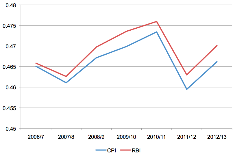
As expected, with the RBI measure of real incomes (accounting for the differences in the impact of inflation rates across the population), we find the distribution is consistently more unequal than CPI suggests. The rise in inequality, post-recession, is somewhat steeper on the RBI measure and, over time, the distance between the two measures has somewhat widened. Although incomes fell, after the crash, the decline was steepest amongst the middle section of the population, resulting in a more unequal distribution overall. The sharp drop in both recorded over 2011/12 is largely the result of a steep decline in the recorded incomes of the very wealthiest which, as noted, appears to be the result of a sudden collapse in earnings from self-employment. It is not clear how far this represents a real change in the inequality picture, and much of this decline has of course been reversed, post-recession.
6. Data is taken from ONS, “The Effects of Taxes and Benefits on Household Income, 2012/13”, Table 14a
7. If imperfect – see comments in Thomas Piketty (2014), Capital in the 21st Century, Cambridge, MA.: Harvard University Press
RBI explained