RBI explained
The Real Britain Index
Introducing the Real Britain Index
The Real Britain Index (RBI) is an attempt to correct for some of the inevitable biases in the official inflation figures, by showing how the inflation rate differs across the population. It is based on the same ONS figures as the official CPI rate, and uses a similar methodology for calculation. It should, then, as far as possible, be directly comparable to the official measure, but is intended to better reflect the impact of price rises on those with different incomes.
RBI divides the population up by income into decile groups, each covering ten percent of the total population, from the poorest to the richest. Using data from successive ONS Family Spending surveys, it constructs a basket of goods for each decile, based on its average spending in a given year. (These weights are given in the Appendix.)
The complication at this point is the fact that expenditure on different items will not (and does not) vary only with income: relative prices will also affect relative consumption. The rate of price increases for different goods will change people’s consumption patterns, as they substitute (as far as they are able) amongst different products in response. But this means that the expenditure weights we would wish to use could vary over time, as different income groups substitute different goods in response to price increases.
The impact of this substitution effect, over the period currently covered by the RBI, is not huge. Outside of housing costs (to which will return), the largest variations are, as expected, in the “Recreation and culture” category of expenditure, pre-eminently representing discretionary spending: the share spent by the poorest 10% on this has fallen by 2%; the share spent by the richest 10% has increased by nearly 2%. Already we can see the differential impact of price changes: discretionary spending by the poor has been squeezed, but the rich are enjoying more freedom.
Looking at housing, we find that whilst the share spent on rent and other housing costs (including utilities) has increased by 4% for the poorest, it has increased by only 1% for the richest decile. This, shows the first impact at work, that of Engel’s Law: rapid price increases in non-discretionary spending have resulted in an increase in the proportion this items take of the poorest income. The rich are squeezed less dramatically. The table below summarises the two changes we have highlighted.
Difference between 2006 and 2012 expenditure shares by decile group (percentage points)
| Decile group | Poorest | Second | Third | Fourth | Fifth | Sixth | Seventh | Eighth | Ninth | Tenth | All |
|---|---|---|---|---|---|---|---|---|---|---|---|
| Net rent, fuel & power | 3.681 | 4.401 | 4.146 | 5.145 | 4.421 | 3.444 | 3.717 | 3.114 | 3.140 | 1.419 | 3.371 |
| Recreation & culture | -2.035 | -1.330 | -0.649 | -0.487 | -0.661 | -0.695 | -0.750 | -0.633 | 0.847 | 1.790 | 0.005 |
It is on mortgages, however, that the most glaring inequalities begin to appear. Broadly, the richer the decile group, the higher the average spending on mortgages, as we would anticipate. For 2012, this amounted to an average mortgage spend of £14.50 a week for the poorest 10%, and £99.10 for the richest 10%. As shares of expenditure, however, the variation was much less pronounced: from around 6% of all spending, on average, for the poorest, to around 10% for the wealthiest. The figure increases because there is also a substitution effect at work: whilst the poorest 10% spend, on average 12% of their total expenditure on rent, this falls to only 6% of the wealthiest.
This capacity to substitute introduces some peculiar effects into the whole table. Because interest rates have been so low, and therefore mortgage repayments also low, there has been a distinct decline in relative housing costs for mortgage holders over the last few years. With housing both a necessary expenditure, and one where demand is generally fixed – most people have only one home, and stick with it – a declining relative price of housing is equivalent to an increase in disposable income. Since the benefits of this will be the greater, the greater share mortgages claim of total spending, it is another way in which the richest have benefitted from relative price changes over time. For those in the bottom half of the income distribution, less likely to hold mortgages (and less able to claim one), increases in the price of rents have had precisely the opposite impact over time, squeezing their real disposable income sharply.
On the other side, there are some categories of expenditure where the richest have lost out. Most glaring amongst these is education expenditure: whilst the poorest 50% of the population spend, on average, barely 1% of their total spending on education (including university tuition fees), this triples than 3% for the richest 10%. Spending on private education is overwhelmingly concentrated in the top fraction of the population, and university attendance remains skewed towards the wealthier end of society – if not quite as skewed. Education prices have more than doubled since 2005, hitting the wealthier. However, with the ONS price index falling by around 10% over the last year, the very wealthiest have seen a substantial fall in their overall level of inflation – excluding costs, even turning into deflation (falling prices) over summer this year.
How inflation has varied across the population
With the different impacts summated, we can generate an overall inflation rate for each of our decile groups. The graph below shows the RBI rate of inflation for the top 10%, the bottom 10%, and the average for all deciles since January 2007. It can be seen that a spread between top and bottom exists, and that, with some exceptions, the inflation rate for the richest is in general lower than for the poorest. However, the swings in the inflation rate for the poorest – its volatility – is almost much greater, ranging from a peak of 7.7% in September 2008, just before the crash, to a trough of 0.78% exactly one year later. This reflects the inability of those on lower incomes to substitute between different expenditure items – with a greater proportion of their income going on essentials, they little choice but to suck up whatever price increases occur.
Inflation rates by selected decile, 2007-2014
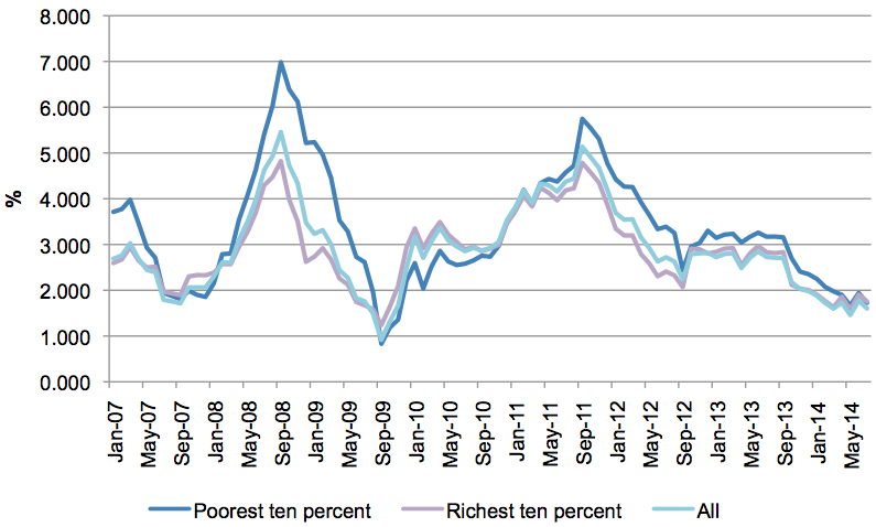
In the exceptional period in the aftermath of the crash, those on the lower end of the income distribution actually experience a lower rate of inflation. Between September 2009, and early 2011, the poorer half of the income distribution had persistently lower rates of inflation, on the RBI measure, than the richer half.
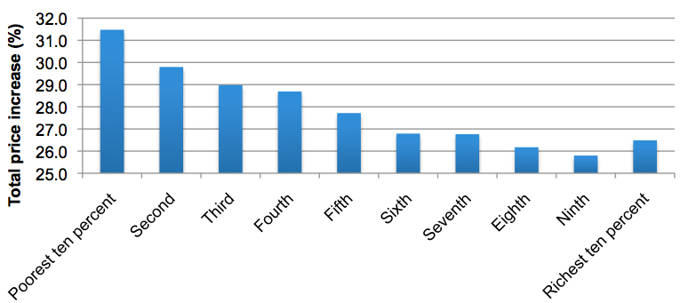
For the period as a whole, from January 2006, our RBI suggests that prices paid by the poorest 10% have risen by nearly 32%. For comparison, the official CPI measure suggests a price increase of just 20%. For the rich, meanwhile, prices have risen by 27%. From poorest to richest, the overall pattern is clear: the better-off you are, the less impact inflation has had. For the whole period, we can see four distinct parts: a sharp increase inflation up to the crash of 2008; a rapid fall in inflation during the very severe recession, for almost exactly a year; rising inflation with (and a little beyond) the slight recovery of 2010; and then a sustained decline in price rises, from the end of September 2011 to date. The table below summarises the total price increase for each of those periods, by income decile.
Total price increases, by period and income decile (%)
| Poorest | Second | Third | Fourth | Fifth | Sixth | Seventh | Eighth | Ninth | Richest | |
|---|---|---|---|---|---|---|---|---|---|---|
| January 2006-July 2014 | 31.5 | 29.8 | 29.0 | 28.7 | 27.7 | 26.8 | 26.8 | 26.2 | 25.8 | 26.5 |
| January 2006-Sep. 2008 | 12.3 | 11.9 | 11.0 | 10.6 | 10.4 | 10.1 | 9.8 | 9.2 | 9.0 | 9.3 |
| October 2008-Sep. 2009 | 0.9 | 0.6 | 1.1 | 1.1 | 0.8 | 0.8 | 0.8 | 1.2 | 1.4 | 1.4 |
| October 2009-Sep. 2011 | 8.4 | 8.3 | 8.2 | 8.4 | 8.2 | 8.0 | 8.1 | 7.9 | 7.8 | 7.5 |
| October 2011-July 2014 | 6.8 | 6.3 | 6.2 | 6.2 | 6.0 | 5.9 | 6.0 | 5.8 | 5.7 | 6.0 |
The general pattern – of lower incomes suffering greater inflation – breaks down only during the exceptional period in the aftermath of the 2008 crash. Inflation fell rapidly, but also became more evenly distributed – the richest 30% even having higher rates than the poorest 30%.
The table below shows the current rates of inflation (as of July 2014) as measured by RBI for each decile group. Allowing for some variation, the current rate of inflation falls pretty consistently as income rises.
Inflation rates by decile, July 2014
| Poorest | Second | Third | Fourth | Fifth | Sixth | Seventh | Eighth | Ninth | Richest |
|---|---|---|---|---|---|---|---|---|---|
| 3.04% | 2.82% | 2.68% | 2.59% | 2.53% | 2.36% | 2.37% | 2.33% | 2.32% | 2.54% |
To give some sense of what these figures mean, a typical civil servant, earning the median pay for the civil service of £24,000, would face an RBI inflation rate of 2.36%. A typical nurse, again earning the median pay, would face and inflation of 2.37%. The headline, CPI, rate of inflation is 1.6%; it can be seen immediately that, for example, pegging pay awards to CPI would result in a loss of real earnings for both these two. Of course, for any given individual, there would be additional impacts: consumptions change with age, and with household size, alongside idiosyncratic variations – different people buy different things in ways we cannot immediately predict. RBI is a guide, and we think a better one that CPI, to actual experience, not a complete description of it.
With overall inflation low, the differences are not, on a month-by-month basis, especially great. Nonetheless, the effect over time can be substantial.
Cumulative inflation by income decile January 2006-July 2014
RBI explained