RBI explained
Inflation and the CPI
The British economy, we are told, is on the mend. After years of stagnation, the Organisation of Economic Co-operation and Development (OECD) estimates that it will be the fastest growing large, developed economy in the world in 2014.1 Employment is rising, with the Coalition government boasting of 1.7m new jobs created since it came to power.
Yet scratch a little beneath the surface, and it is clear that this cheery picture does not match experience for many of us. A return to economic growth has not, yet, turned into a widespread feeling of prosperity. 45% think the economy is recovering, but only 18% expect to be better off next year.2
The reason for this disparity is not hard to find. Since the crash of 2008, wages and salaries for most people have not kept pace with price rises. On the usual measure, average real incomes – after taking account of price increases – have fallen by 8.5% since then, and the decline has continued into this year.3 The situation is unprecedented for generations: you need to go back to the 1870s to find a similar period of sustained decline in most people’s standard of living.
Official inflation figures show that inflation remains at historically low levels. Currently, on the Consumer Price Index (CPI) measure, inflation is 1.6%. This is well below the government’s target rate of 2%, and has been for some time.
But the headline rate of inflation is itself only an average. It aims to capture how prices have changed, over a year, on average. It reflects an overview of the whole experience. That overview, however, need not match up to any particular individual or household’s experience. Different people buy different things, and the prices of these different things change at different rates. Over the last few years, this has become an obvious political issue: whilst average prices, as measured by CPI, have risen by 1.6%, domestic gas bills have risen by 5.1%. Cumulatively, over time, these differences can become substantial: overall average prices, since 2005, have risen 25%, on the CPI measure. But domestic gas bills have much more than doubled.
An inflation measure needs to reflect at least of these differences. To do so, the CPI, like any other inflation measures, looks at what the “average” household consumes over a year to create a typical “basket of goods”. This should, ideally, contain all items relevant to a cost of living, and include them in proportion to their size in the family budget. Food is a substantial item of expenditure; “carpets and other floor coverings” (to pick a CPI category) generally less so. Food is weighted more significantly, in proportion to its average consumption, than are carpets and rugs.
However, because people buy different things, in different amounts, that typical basket of goods will generally not match their experience. This would not be a problem, if the different amounts people spent on different products altered fairly randomly. In general, we would expect these differences to more-or-less cancel out.
But what people buy does not vary randomly across the population. The proportions of their income that different people will spend on different things will vary systematically. Households with small children will, for obvious reasons, spend more on children’s goods than those without. Similarly, pensioners’ consumption patterns tend to be distinct from the young.
However, we want to focus here on something under-reported. Proportions of total expenditure on different items will also vary with different incomes. The poor buy different things to the rich, and, where they buy similar things, they spend different proportions of their income. The reasons for this are simple.
First, there is a minimum level of consumption that is necessary to survive: food, shelter, and utilities clearly fall into this category. Given this necessary minimum, it should be clear that those on lower incomes will spend a greater proportion of their income on essentials than those on higher. They have no choice: these expenditures are essential. This relationship was first suggested for food spending by the statistician Ernst Engel, in 1857. He noted that the proportion of income spent by any individual or household on food tended to fall as income increased – even if absolute expenditure increased. Engel’s Law, as it is known, is one of the rare examples of a very robust empirical law in economics, and has been confirmed repeatedly. Our data confirm it once more: the poorest 20% of the population spend 15% of their income on food. The richest 20% spend 8%.
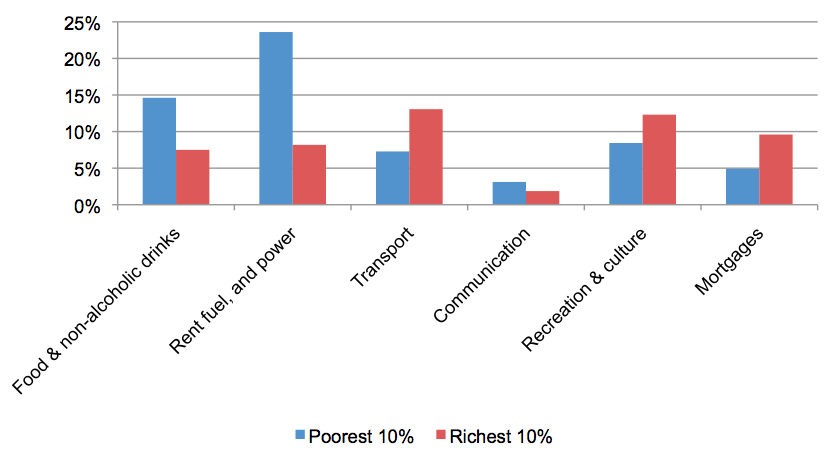
Second, even allowing for this minimum expenditure, it will in general be easier for the richer end of the population to respond to price increases. Because they have more money, they can find it easier to substitute amongst different goods: have covered essential spending easily, they have a great deal of cash left essentially for discretionary items. If the price rises for something that is not necessary, they have the option to spend elsewhere. Looking at our figures, we can see that discretionary expenditure is higher for the wealthy, with “Recreation and culture” accounting for 14% of the richest 10%’s budget, but only 8% for the poorest. The graph below shows these difference for the poorest and the richest deciles, in the most recent year for which we have data.
Shares of household expenditure for richest and poorest, 2012
In other words, our “average” measure of inflation may be skewed by variations in income. What one person experiences as the rate of inflation – as the impact on their standard of living, given their income – will differ, depending on how much they earn. This matters especially under two conditions: first, where inequality is significant, meaning the dispersion of different inflation impacts may also be substantial; second, where the costs of essentials have risen more than other items, hitting the poorest, hardest.
Both conditions have applied to the UK over the recent past. As noted, gas is now 2.5 times more expensive than it was in 2005. Over the same period of time, however, the price of cameras and photographic equipment (clearly not an essential item), on a like-for-like basis, has dropped to 12% of its 2005 level. Inequality, meanwhile, has risen sharply over the last three decades. Taken together, both of these factors could produce a worsening skew in the headline rate of inflation: it could be drifting further, and further, from most people’s experiences of price increases.
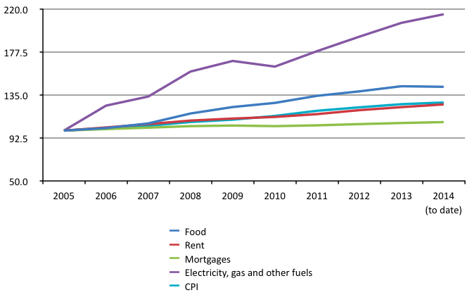
Essentials have risen enormously in price
Taking housing costs, utility bills, and food as unavoidable, essential items of expenditure, the graph below shows what has happened to the prices of each since 2005. Also included is the Consumer Price Index (CPI) measure of inflation, which attempts to show the average behaviour of prices. Taking 2005 as the base year, it is immediately clear that price increases of both fuel and electricity, and of food, have been very significant over this period of time. Food prices have risen by 43%; water charges by 51%; and electricity and gas bills by 115%.
Housing costs, meanwhile, and particularly for mortgage holders, have been significantly more restrained. For owner-occupiers, low historically interest rates since 2009 have undoubtedly helped restrain the cost of their housing; for those in rent the situation is more complex, with renters in London facing sharper increases than the rest of the country. (The ONS data we have here do not, unfortunately, allow us to make this level of disaggregation.) Nor does the data capture changes in the quality of housing, with those renting potentially pushed into lower quality homes by price rises.4
Prices of selected items, 2005-2014
Nonetheless, it should be immediately clear that the extent to which any individual has to spend proportionately more of their income on essentials, they will be harder hit by price increases that are significantly above the headline rate of inflation.
Problems with the CPI
Decisions about what to include, or exclude, from the basket of goods will obviously affect the measurement of inflation. CPI became the official measure of UK inflation in 2003, replacing the earlier Retail Prices Index (RPI), as part of a drive to harmonise inflation measurement across the European Union. Along with some changes to mathematical method used to generate the index,5 CPI also tweaked the basket of goods it uses as a reference. One of these tweaks is highly significant: CPI excludes owner-occupied housing costs, specifically mortgage payments, whilst RPI made an attempt to include them. (Both have always included rent.)
Housing is a very substantial part of any individual or household’s expenditure. And around 70% of all households in the UK are owner-occupiers. Most of these hold mortgages, on which monthly payments are due for a long period of time. Excluding these costs, therefore, is excluding a major part of what most of the country experiences. ONS have recognised this, providing also a “CPIH” measure that includes owner-occupied housing costs. With interest rates remaining historically very low, the differences between the two are not huge: about 0.1% separates them, on the most recent figures. Nonetheless, with the prospect of interest rate increases in the future, a fair measure of the cost of living must look to include all housing costs, including mortgage payments.
1. Reuters, 12 March 2014, “British economy set to be fastest growing among G7”
2. YouGov/Sunday Times, 15 Jun 2014. Full data.
3. ONS, 5 April 2013, “Real wages down 8.9% since 2009”
4. See, for example, Davies, B. and Turley, A. (2014), Back to Rising Damp: addressing housing quality in the private rented sector, Newcastle: IPPR North
5. Technically, CPI uses a geometric rather than arithmetic mean, on the grounds that this is less prone to an upwards bias over time.
RBI explained